I may have spoiled my first quilt project by fabricating the use of old sheets for the utmost part. It was soft but matted so badly that it ruined my whole design completely. Fabric quality is highly essential. High-quality cotton or linen fabrics, such as those from Art Gallery Fabrics, are durable since they are tightly woven and have a smooth, long-lasting finish. Use medium-weight fabrics as they are the best in quilting, as there is a proper balance between strength and handling ease.

1. Understanding Color Harmony
Color harmony is a crucial aspect of quilting, as it can make or break the overall aesthetic of a quilt. When selecting colors for a quilt, it’s essential to consider the color wheel and how different colors interact with each other. There are several principles of color harmony that quilters can use to create a visually appealing quilt, including:
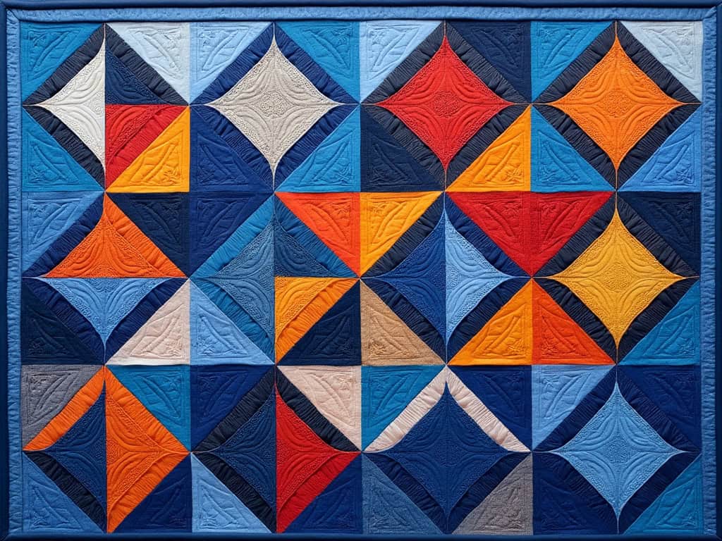
- Monochromatic: Using different shades of the same color can create a soothing and cohesive look. I once made a quilt using various shades of blue, from navy to sky blue, and the result was a serene, ocean-like effect that was both calming and visually interesting.
- Complementary: Pairing colors that are opposite to each other on the color wheel, like blue and orange, can create a vibrant and dynamic quilt. However, it’s important to exercise restraint. I learned this the hard way when my first attempt at a complementary color scheme ended up looking more like a circus tent than a cozy quilt.
- Analogous: Using colors that are next to each other on the color wheel, such as blue, green, and teal, can create a harmonious and pleasing effect. This approach is great for creating a quilt that feels cohesive without being too bold.
- Triadic: Using three colors that are equally spaced from each other on the color wheel can create a balanced and vibrant quilt. For example, a quilt using red, yellow, and blue can be both eye-catching and harmonious if done correctly.
Quilters can also use color harmony to create contrast and visual interest in their quilts. For instance, using a bold, bright color as an accent can add a pop of color to a quilt and create a focal point. By understanding and applying these principles, you can design quilts that are not only beautiful but also harmonious and balanced.
2. I Discovered the Joy of Finding the Perfect Pattern Scale and Design for My Quilts
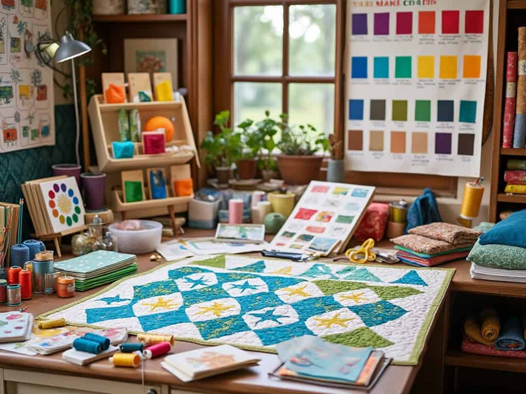
When selecting a quilt pattern, it’s essential to consider the scale of the design and how it will work with the fabrics and thread colors chosen. Any too-large or too-small pattern can overwhelm or underwhelm the quilt, respectively.
I remember a time when I chose a large floral print for a quilt with small blocks. The result was a chaotic mess of petals that lost all definition. It was a valuable lesson in matching pattern scales to the size of the quilt blocks. Large patterns are best suited for larger blocks, where the design can be fully appreciated, while smaller patterns work well for intricate designs.
Quilters should also consider the design compatibility of the pattern with the fabrics and thread colors. For example, a busy, intricate pattern may not be the best choice for a quilt with bold, bright fabrics. On the other hand, a simple, geometric pattern may be a good choice for a quilt with subtle, muted fabrics. The key is to ensure that the pattern and fabrics complement each other, rather than competing for attention.
By carefully considering pattern scale and design compatibility, you can create a visually appealing and cohesive quilt. This attention to detail will ensure that your quilt tells a story and looks harmonious.
3. I Learned the Importance of Testing Fabric Characteristics Before Quilting
You know, fabric and I do not have a lifetime bond, until I do the ‘wash and wiggle test’. When considering quilt patterns, it’s crucial to assess the scale of the design to ensure compatibility with your fabric and thread colors. Once I have done a zigzag stitch and run it through a quick prewash, I assess how much the edges of the fabric stretch or curl. You will cry on this one: if you discover that your fabric shrinks after sewing, it’s heartbreaking.
4. My Strategy of Choosing Thread Color
Do Darker Threads work better?
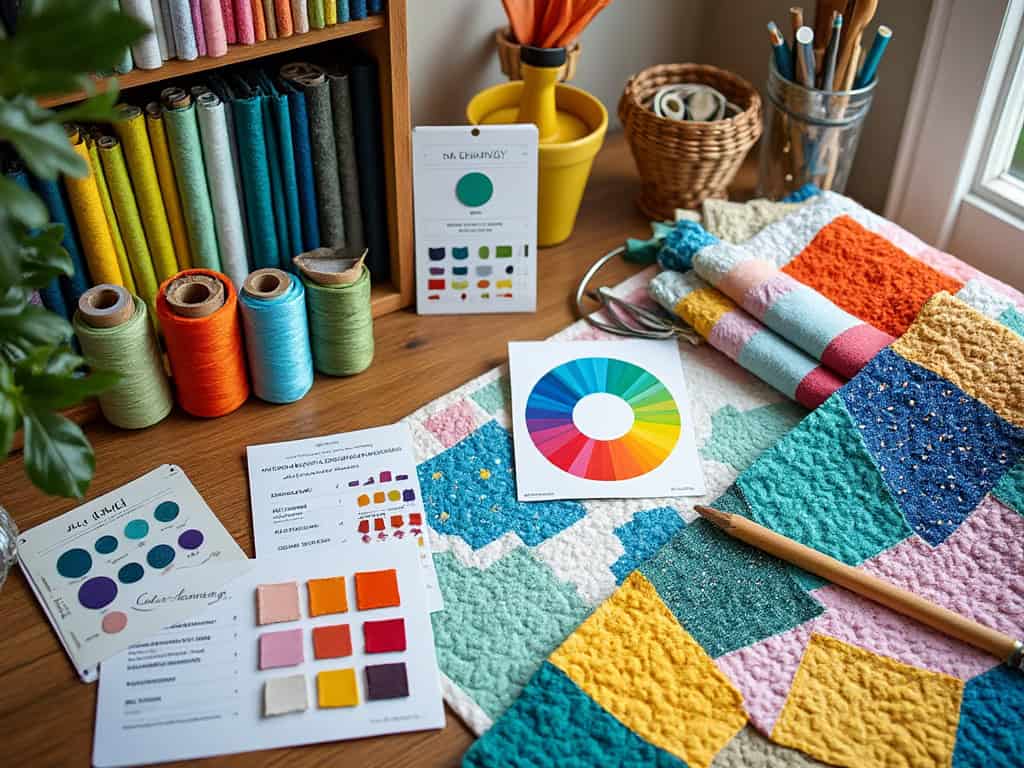
I recall a time when I was making quilts for a baby blanket and for some reason I chose to use a pale thread for the stitching. Each was only noticed because they slightly indulged my slouching stitches. In most cases, however, I reach for threads darker in shade than the majority of my fabric. It merges magically, conceals the discrepancies, and provides the design with a finishing touch.
For Quilters, neutral thumb’s up
The color of the threads’ neutral shades is ideal for hectic quilting. I have white, beige, ash, and black thread for my embroideries because of their beauty. One time, there was some cream blocked somewhere in between, and it was quite a subtle shade of beige, so I used a brick red color. It felt like someone had ransacked the place without asking. What’s the lesson? Neutrals save us again and again.
Testing Thread Visibility
In sewing, there seems to be a trick that I believe works well which involves placing different colored threads on a piece of fabric and testing them negative at the end. Once, I had a beautiful combination of threads and fabric under my desk lamp which was okay, but who would want to wear that fabric in daylight? Yes, it would not look good at all. You can use it as an example too.
5. Color Theory and What It Taught Me About Quilting
Complementary Colors and the Color Wheel
Using color theory changed the game of the quilting which is such a wonderful mixture. The use of opposites such as blue and orange can be vibrant, but I’ve begun to my cost to exercise restraint as well. It was somewhat too close to a circus on the first one, I included bright colors but added the neutral to balance. If there is too much of one color, many people might not purchase the item as it might feel unappealing.
Monochromatic Schemes
For most of my designs for elegant quilts, monochromatic designs are my preference. There was a time blue quilt, I made a navy-sky-blue-powder-blue quilt, and the outcome was captivating ocean definitely made the quilt look nice. The trick about this time was using different shines and cast of one primary color which gave an appearance of dimensionality yet not touchy.
Balancing Warm and Cool Tones in Your Quilts
When it comes to warm and cool tones, it feels like coordinating a family dinner in this way — you want to pull in everyone and get the signs together. Red and orange can serve well as accents but it is tones like blue that provide the calm feeling and setting. Well, there was a moment when I attempted this without knowing, and utilized only warm tones, and the quilt felt frantic instead of warm. So, moderation is a beauty.
6. Thread, Yarn, and Fabric Compatibility in Quilting
When it comes to quilting, the thread, yarn, and fabric used can greatly impact the overall look and feel of the quilt. Here are some tips for selecting compatible thread, yarn, and fabric:
- Thread: Choose a thread color that complements the fabric colors and pattern. Variegated threads can add a fun and playful touch to a quilt. I once used a variegated thread on a quilt with a simple design, and the shifting colors added a beautiful gradient effect that brought the quilt to life.
- Yarn: Use yarn that is compatible with the fabric and thread. For example, a cotton yarn may not be the best choice for a quilt with wool or silk fabrics. I learned this lesson when I tried to use a cotton yarn on a silk quilt, and the result was a mismatched mess. Matching the yarn to the fabric ensures a cohesive and professional finish.
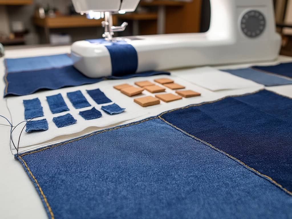
- Fabric: Choose fabrics that work well together in terms of color, texture, and scale. Consider the weight and drape of the fabric, as well as its durability and washability. I once made the mistake of combining heavy denim with lightweight cotton, and the quilt ended up looking lopsided and awkward. Ensuring that the fabrics are compatible will result in a more balanced and visually appealing quilt.
By paying attention to the compatibility of thread, yarn, and fabric, you can create a quilt that is not only beautiful but also durable and functional.
7. Why I Pay Attention to Thread, Yarn, and Fabric Compatibility in My Quilts
Weight of Thread in Terms of Fabric Type
Have you ever tried to quilt a piece of denim utilizing a very fine thread? Well, I have and let me put it mildly, my poor sewing machine squealed in agony. Heavier denims are better suited with thicker threads such as the 30 wt and 40 wt types, and light cotton fabric can use 50 wt threads. It is all about the right match and the right combination.
Whether to Blend Threads or Contrast Threads for a Quilt
In my mind, I am often torn between the two ideas, do I blend my thread or do I contrast my thread? Once I tried to use hot pink thread on a quilt made with black fabric and yes it was bold, but that simple thread just bloated the quilt design. Blending of threads allows maintaining attention on the fabric, whereas, contrasting threads complement your stitches.
Determining Tension Settings on a Stitching Machine
There is nothing more unprofessional than puckered fabric that is caused by improper tension during construction. Before starting any type of project, I conduct a tension test on a fabric swatch. Once, I could not perform this step, and the tension problems made my quilt look like it had spent a lot of time in the turbulence zone. This is why these days, I never miss out on such tests.
8. Getting the Hues and Tones Right Using Advanced Techniques
Placeley Coloring Band Strategy
Placement is an important aspect that can make a quilt to be very desirable. On a quilt with a floral design, a green thread was used to outline the leaves which complemented the design but did not overtake the other features. Try to consider thread as a kind of instrument for focusing the viewer’s eye more delicately.
Using Variegated Threads
Variegated threads can add a fun and playful touch to a quilt. These threads feature a gradual color change along the length of the thread, creating a unique and interesting effect. When using variegated threads, quilters should consider the following tips:
- Choose a variegated thread that complements the fabric colors and pattern: I once used a variegated thread on a quilt with a simple design, and the shifting colors added a beautiful gradient effect that brought the quilt to life.
- Use a variegated thread as an accent or highlight, rather than as the primary thread color: This ensures that the variegated thread enhances the quilt without overwhelming it. I found that using variegated thread for the quilting stitches, rather than the piecing, created a subtle yet striking effect.
- Experiment with different stitch lengths and densities to create a unique and interesting effect: Variegated threads can create different effects depending on how they are used. I once tried using a variegated thread with a dense quilting pattern, and the result was a stunning, almost watercolor-like effect.
By experimenting with variegated threads, you can add a unique and playful touch to your quilts, making them truly one-of-a-kind.
Stitching with Different Color Threads in Quilting
Different thread colors can seem scary but it is a good decision. With blocks, I once used gradient threads to establish an ombre effect on the blocks. To achieve such a pattern, first assign specific colors to designated quilt sections to achieve a stained-glass pattern. All these two projects added a new aspect to my designs.
As always, I wish to pass on some of the lessons (sometimes learned the hard way) and that the next time you do a quilt it is with more confidence, warmth, and a little laughter when things do not go according to plan.
9. Bringing it All Together: Creating a Cohesive Quilt
Creating a cohesive quilt requires careful consideration of all the elements, including the pattern, fabrics, thread, and yarn. Here are some tips for bringing it all together:
- Start with a clear vision of the quilt’s overall aesthetic and theme: Having a clear idea of what you want to achieve will guide your choices and ensure a cohesive result. I always start by sketching out my ideas and gathering quilt inspiration from various sources.
- Choose a pattern that complements the fabrics and thread colors: The pattern should enhance the fabrics, not compete with them. I once chose a busy pattern for a quilt with bold fabrics, and the result was overwhelming. A simpler pattern would have allowed the fabrics to shine.
- Select fabrics that work well together in terms of color, texture, and scale: Ensuring that the fabrics complement each other will create a harmonious quilt. I always lay out my fabric choices together before starting to see how they interact.
- Use thread and yarn that complement the fabric colors and pattern: The thread and yarn should enhance the quilt, not distract from it. I often test different thread colors on a fabric swatch to see how they look before committing.
- Experiment with different stitch lengths and densities to create a unique and interesting effect: Don’t be afraid to try new things and see what works. I’ve discovered some of my favorite techniques through experimentation.
- Don’t be afraid to try new things and take risks – it’s all part of the creative process: Quilting is an art, and sometimes the best results come from taking risks and trying new techniques. Embrace the process and enjoy the journey.
By following these tips, quilters can create a cohesive and visually appealing quilt that showcases their skills and creativity. As always, I wish to pass on some of the lessons (sometimes learned the hard way) and that the next time you do a quilt it is with more confidence, warmth, and a little laughter when things do not go according to plan. Happy sewing!
